HTML and CSS
(This lab is adapted from one created by Prof. Amy Csizmar Dalal, who really likes earthquakes!)
Objectives
- Introduce you to HTML and CSS, if you have not used them before, or refresh your knowledge of HTML and CSS if you have
- Understand the split between content (HTML) and presentation (CSS)
- Create a web page that contains some of the elements described in Krug
Collaboration
You may work on this individually or with your project team. Feel free to skip around and / or modify the tasks to fit your own project.
Prerequisites
This lab assumes that you’ve completed the HTML and CSS reading and/or you have a bit of familiarity with HTML and CSS coding. I suggest you have W3School’s HTML Tutorial open while you complete this lab.
Accept the HTML and CSS Lab Starter Code assignment linked on Moodle, clone the repository, and work in there for this lab.
Introduction
In today’s lab, you are going to create a web page describing the dataset you’re using for the project. The page should contain the following:
- A header/banner at the top of the page
- Top-bar navigation
- A few paragraphs of descriptive text.
- One of these can be a bulleted list.
- One of these should be enclosed in some sort of box or container.
- The web page must consist of a single HTML file and one or more CSS files.
Step 1: Outline your content
You should work from the general sketch that your team has decided on for your project’s homepage, but you might need to adapt it slightly to fit in all the elements. That’s fine, you aren’t stuck with what you make today; the goal is just to get practice which each of these different elements.
We’ll start with the HTML piece of this first, then style it later.
In the readings on effective web design, Krug focused on things like content hierarchies, whitespace as separators, and so on. Your site should adhere to these same principles.
If we look at this sketch:
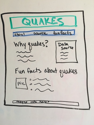
we can note some things about information hierarchies:
- There are a few major headings, but no subheadings
- Each heading has one paragraph and/or one bulleted list of text that follows. These form sections for the page.
- The image also belongs to one of these “sections”
- Eventually, the middle section will need to be styled so that it is set off by a border and floats to the right. But we just need to note that now, not worry about how we’re going to accomplish it.
- We also have two distinct “containers” at the top, one for the banner and one for the top bar navigation. Again, it’s not clear how we’re going to style these, but we do know that they form distinct logical entities.
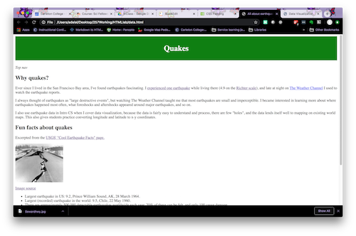
We’ll need to go back and fill in some of the details later, but let’s at least get the bare minimum done here. Download the data_v1.html HTML file and take a look at it so that you can see how the sketch could be translated into content.
The <!-- --> lines are comments. We don’t need them here, but they are useful to walk you through various things.
DO THIS: Write the HTML for the page you sketched. Name your file data.html. View it in your browser to make sure all of the content areas appear as you expect.
How do I view my web pages? Is there something special I need to do?
-
You can actually view local files in your web browser. There should be an “open file” option in the File menu of your browser. Also, if you double click on an HTML file, it should open automatically in your web browser.
-
If you are using WSL, right-click and select ‘reveal in Explorer’, then double click as normal and it should display in your web browser of choice.
Step 2: Fill in the header info
While this page will render just fine (although look somewhat sparse) in the browser, we often include additional information in the header. At a minimum, we need to provide links to any external style files (and, later on, Javascript scripts) attached to this page.
We’ll write our style file in a moment, but let’s provide the link to it now.
DO THIS: Add the following somewhere in the <head> .. </head> section of your page: <link rel="stylesheet" href="datastyle.css">
This tells the browser to go look for a style file named datastyle.css in the same directory as this HTML file.
If you open your HTML file in your browser now, you won’t see any change. If the browser can’t find the style file, or doesn’t know how to render a particular style, it will just ignore it and render it in whatever way it considers the default. This is an example of failing gracefully.
Step 3: Creating the basic CSS
Let’s start making our web page look more like the sketch. In this part of the lab, we’ll work on setting up each of the sections (divs). In the next part, we’ll get fancier with the styling.
Top level navigation
Let’s start with the banner and the navigation at the top. Let’s keep things simple here: a solid color box for the banner, with the page title, and a white box with a blue outline for the navigation bar.
DO THIS: Add something like this CSS to make the banner:
h1 {
    padding-top: 1em;
    padding-bottom: 1em;
    background-color: green;
    color: white;
    text-align: center;
}
This says “style the top level heading with a green background and white text, center-aligned. Pad the top and bottom of the text with the width of a text element.”
Here’s what that exact style looks like (feel free to change aspects!):
Now let’s add a navigation bar. For this, you can refer to the CSS tutorial and this tutorial and structure the bar like a specially-formatted list. This means that you will need to change the HTML, too.
DO THIS: Add the CSS to make the navigation bar (comments for clarity, feel free to tweak things to make it fit the style you want):
/* The nav bar is an unordered list whose items are not bulleted.
     We only want to apply this styling to unordered lists inside of the nav
     tag.
*/
nav ul {
    border: 2px solid blue;
    list-style-type: none;
    overflow: hidden;
}

/* Navigation bar list items should render starting at the left margin. */
nav li {
    float: left;
}

/* Navigation bar items should link to elements on the page, or to other pages.
     This is the "a" tag. So this says "apply this style to links within the nav bar".
*/
nav li a {
    display: block;
    color: blue;
    text-decoration: none;
    text-align: center;
    padding: 14px 16px;
}

/* When you mouse over something in the nav bar, turn it blue. */
nav li a:hover {
    color: white;
    background-color: blue;
}
And here’s the HTML:
<nav>
<ul>
<li><a href="#why">Why quakes?</a></li>
<li><a href="#fun">Fun facts</a></li>
<li><a href="#data">Data source</a></li>
</ul>
</nav>
The CSS illustrates some important points about CSS:
-
CSS cascades, as the name states. This means that multiple styles may apply to the same element. For instance, all of the navigation bar items are list items AND list items that link somewhere AND list items that link somewhere that can be moused over. All of the styles specified for all of these conditions apply.
-
We can specify how broadly or narrowly to define a style. For instance, anything on the page that has an
h1tag will be styled the same way. But, only list items within the nav environment will float left and be listed inline.
What happens if styles conflict? Great question! Your browser should render the styling for the most specific tag/environment/class. If everything is of equal scope, then it goes with the last style listed.
- Notice I said should, not will. One thing you will learn is that CSS is somewhat of an art form. Sometimes you expect things to render one way, and they render a totally different way. It could be because your style sheets conflict in subtle ways. Or your browser could be imposing its own style. Or Mercury could be in retrograde. Sometimes, you just have to try a bunch of things….or consult your friend Dr. Google. If you do run into a sticky style issue, post your quandary on CampusWire and/or see me or one of the lab assistants.
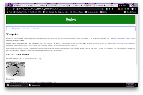
The nav bar should look something like this (depending on how you changed the style):
Margins, margins, margins
Did you notice that the page runs right up to the edge of the browser? Let’s add some margins. This will cut down on visual clutter and make the text a bit easier to read (which will make the page easier to scan!).
DO THIS: You probably want the margins to apply to the entire document, so specify this in the body tag style:
body {
    margin-left: 5%;
    margin-right: 5%;
}
This specifies that the margins on either side of the page should be 5% of the total page width. You could specify this in pixels, instead.
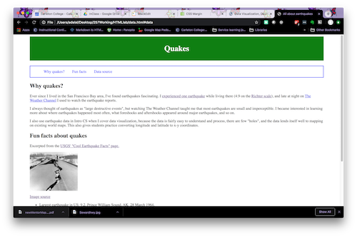
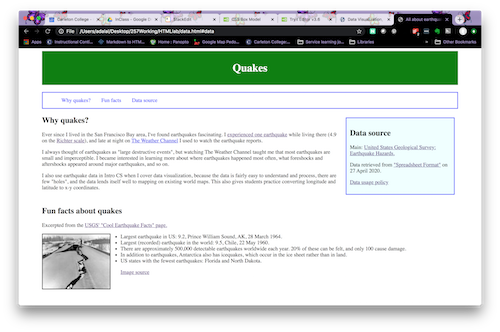
Here’s what the page looks like now:
Float a box
In the sketch, the data source info is highlighted in a box to the right of “why quakes?”. Let’s style that now.
DO THIS: Add a highlight div if you haven’t already and then add CSS similar to:
div.highlight {
    background-color: azure;
    width: 300px;
    border: 2px solid blue;
    float: right;
    padding: 10px;
    margin: 10px;
}
div.highlight says “style anything that has the tag div class="highlight" this way”.
With that change, here is what the page looks like now:
Step 4: Making things fancier
Let’s see if we can spruce things up a bit more.
Fun with fonts
The default font makes my eyes hurt. Let’s switch to a sans-serif font (which is easier on the eyes) for all of the text. And let’s make the nav bar text slightly bigger and boldface
DO THIS: Use CSS similar to the below to change the font style of your website:
/* This means "apply this style to h1 and h2 tags" */
h1, h2 {
   font-family: Verdana, Geneva, sans-serif;
}

p {
    font-family: Verdana, Geneva, sans-serif;
    /* This next line gives us some extra spacing within a paragraph*/
    line-height: 1.4;
}

li {
    font-family: Verdana, Geneva, sans-serif;
    line-height: 1.4;
}

nav li {
    float: left;
    font-size: 1.1em;
    font-weight: bold;
}
Note again that the li style cascades, so that the nav bar font is also sans-serif!
There are a few more things in the data.html and datastyle.css files, so feel free to look through them and play around with more aspects of your page.
Step 5: Attaching to Flask
The final question you are probably wondering about is how to use CSS with Flask. The HTML files go in a templates folder as you already know, but the CSS goes in a different location (wondering why they have to go in such specifically named folders? Because of a paradigm called convention over configuration).
The CSS files are considered ‘static’ files, and so they should go in a new folder called ‘static’. To point your HTML file to which CSS it should use, you can use the following when in a Flask app:
<link rel="stylesheet" href="{{url_for('static',filename='datastyle.css')}}">
DO THIS: Make a basic Flask app to connect to your HTML and CSS files. Push everything to your lab repository and then continue working on your ID Front-end.
File links
If you want them all in one place: